(For a more detailed explanation, refer to this YouTube presentation, to this paper or also to this more recent one (here in a better format).
Imagine the virus outbreaks in a few different places. As a countermeasure, we can adopt different levels of lockdown. The video below
shows the virus spreading (I = number of infected individuals) in a squared region (x1 and x2 being space coordinates) corresponding to 4 different lockdown levels, the leftmost one corresponding to no lockdown at all.
The role played and suffered by care homes (RSA in Italian) has come dramatically in the foreground. Below is a simulation of what might have happened in the area around 2 care homes.
S is the number of individuals that can be infected (Susceptibles), I is the number of Infective individuals, H is the number of quarantied individuals and R is the number of the individuals that Recovered. They are all functions of t (time) and space (x1,x2).
Let's see how people's movements affect the virus spreading. First, assume no one moves and a small group of infected individuals appears in the bottom left of the square we consider.
Now, we superimpose to the virus spreading the movement of the commuters. Say that between 06:00 and 09:00, those who are not in quarantine move towards the city centre, sited at (0,0). Later, between 17:00 and 20:00, they all go back home. Here is the resulting spreading. At about time 4 (meaning the 4th day), some commuters are infected and the virus diffusion is enhanced by the commuters' travelling.
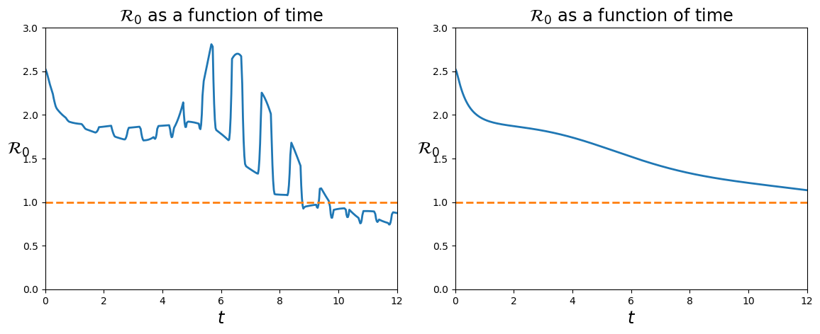
To quantify the differences in the virus diffusion, see the time dependent R0 index, left in the case with movement, right in the case no one commutes:

Careful! After day 9, it looks like the situation with movements (on the left) were "better" than that with no commuting (right), since the left one has a lower R0 index, actually even lower than 1. Think about it and you'll see why it is indeed a further sign of a much worse situation. The R0 index measures how fast the disease spreads, but if there are (almost) no more healthy individuals...
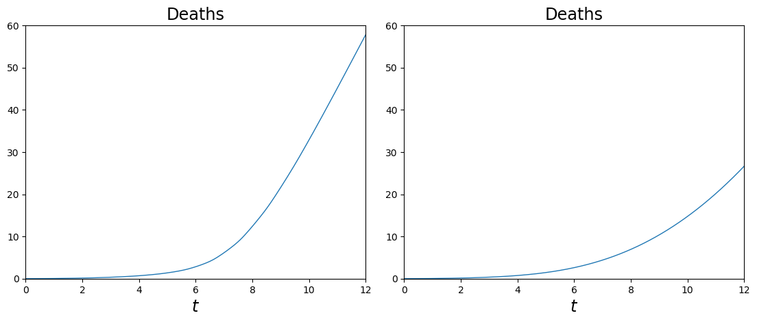
Indeed, a better, though dramatic, evaluation of the "costs" corresponding to the two situations (with and without commuting) is given by the graphs of the number of deaths, here below. (Again, the case with commuting is on the left, while on the right there is no movement).

Many models are able to describe features of the covid pandemic. The one used in this page is (relatively!) simple, it takes into consideration age differences as well as spatial distribution and the role of quarantine is highlighted. Here is it:

where the "diffusion" is described by the term

The dependent and independent variables are

while the meanings of the other quantities, all dependent on (t,a,x) are:


To fully understand this model, a little more than Calculus 2 is necessary. Nevertheless, in this presentation you find a rather simple description. A similar presentation, though shorter and in Italian, is here.

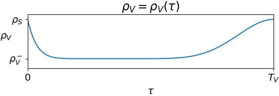
Here, ρV=ρV(τ) describes the efficacy of a vaccine after time τ from injection. Similarly, ρR=ρR(τ) quantifies the level of protection from infection after time τ from recovery.
A possible qualitative behavior of the function ρV=ρV(τ) is below.

The value ρS corresponds to how easy/difficult it is for a susceptible individual to get infected, while ρV- quantifies the best efficiency of the vaccine. For a perfect vaccine, ρV-=0.
On the other hand, the effect of two consecutive doses of a vaccine might be described by the following diagram.

This model displays other features, such as pandemic waves, and allows tocompare different vaccination strategies. Refer to the paper.
The content of this page comes from
Rinaldo M. Colombo, Mauro Garavello, Francesca Marcellini,
Elena Rossi
An Age and Space Structured SIR Model Describing the Covid-19
Pandemic
Journal of Mathematics in Industry, 10, 22, 2020
Preprint, 2020.
Rinaldo M. Colombo, Mauro Garavello
Infectious Diseases Spreading Fought by Multiple Vaccines
Having a Prescribed Time Effect
Acta Botheoretica, 71:1, 2023
Preprint, 2021